We have good news to report for the end of the year; a project that the design team has been secretly working on for months… We have completely redesigned the Gandi user interface to help offer the most trustworthy user experience possible.
Why we redesigned the user interface
Last year, as many of you are likely aware, we released a whole new version of Gandi. But in reality, the interface itself was somewhat fragile. Besides a few missing features here and there, added over the course of the year, some of the fundamental decisions we made designing this interface just weren’t sound. Navigation, spaces, colors, and the overall experience all felt a bit confused and complicated. It was a major milestone for us to release a new version of our platform and important for our development as a company, and the fact that it came in such a period of transition is evident in the resulting interface.
Throughout 2018, we’ve been growing and learning behind the scenes, refining the way our teams work together and collaborate and returning our focus to the basics, asking ourselves some of the bigger picture questions, and thinking about how to answer them in the most efficient manner possible. After a few intense months, we can be proud of the new Gandi Admin application we’ve built; a strong and solid enough interface to continue to offer the powerful tools we provide to our customers.
What’s new in the user interface
The goal of this project was to simplify site navigation, clean up some complex code to reduce load times, improve the overall coherence of elements from one page to another, and strengthen the application as a whole to one our customers can continue to count on.
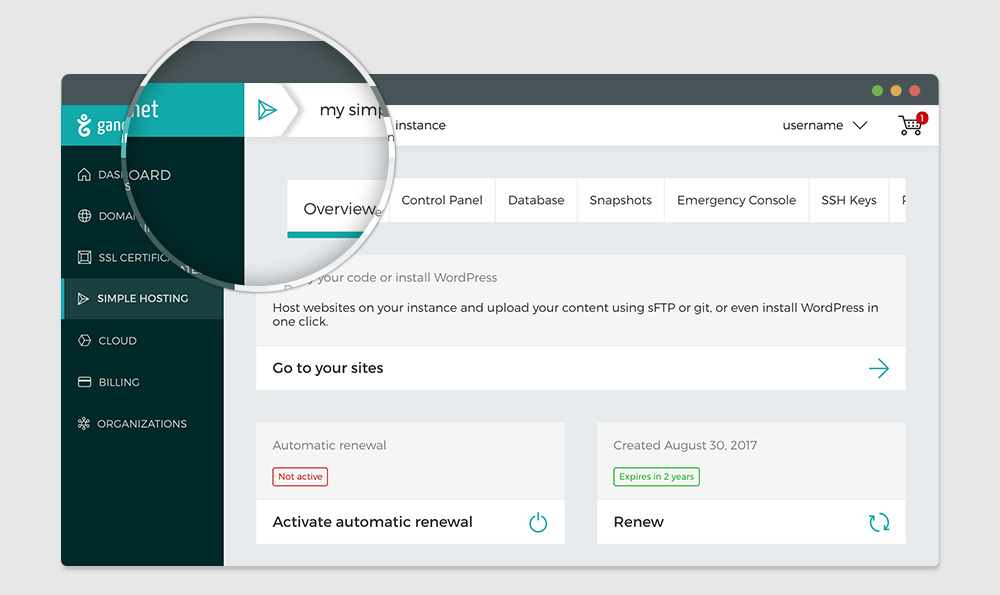
We deleted the organization filter from the user menu. You now have a unique user menu that lets you update your user preferences and logout.
You can now filter your products by organization directly from the page listing your products.
The main navigation is staying the same, but we have simplified the style somewhat. No more disorienting moving menus. You can now decide for yourself whether you want to open our close a menu, according to your screen resolution or your browsing habits.
We also reworked the structure of individual pages so as to have concise instructions. No more unused space, no more repeated information. No we have all the space we want for clear and efficient content, fit for professional use.
We also simplified the breadcrumbs and moved it into the page header to make it easier to see.
We also took a look at how we’ve been using colors. No more background colors or gradients with no particular meaning.
Now, the colors we use each have a specific purpose, and the background color stays the same everywhere so that you can forget about it and focus on what really matters.
We simplified the mobile version of the site as well. The complicated interface on tiny screens is gone.
We have also cleaned up the pages with forms. Now you can fill out the forms without getting distracted by random, non-pertinent information.
Domains, Simple Hosting and Gandi Cloud, and SSL certificates are complicated enough. We don’t need to add complexity in the interface. We now have a clean and clear interface that we can continue adding new features to.
What’s next
The goal of this redesign wasn’t to rethink every feature or the content of the pages themselves, but moreover to provide a baseline user interface to work off of. We now have all the space necessary to examine every page in detail, product by product.
In the coming days, we’ll be fixing the inevitable little bugs that come up, update pages like the login page and the shopping cart pages, in order to ensure they mesh with the new overall style and user experience. We’ll also be updating the style of feedback messages.
Next, we’ll move on to overhauling each product page in order to provide the most pertinent information and thereby let you efficiently manage your products.
We’ll be reducing the number of tabs, in particular for domains management and hosting management in favor of presenting all relevant information in a single place.
In addition, we’ll be highlighting the various links between products to help you see in the blink of an eye that everything you have is configured, hosted, and secured as you want it to be.
Finally, we’ll keep working on improving the performance of the site so as to offer you the best possible user experience.
2019 will be a good year at Gandi
And because your feedback is crucial to the ongoing improvement of our platform, please do not hesitate to let us know what you think about these new changes by emailing us a feedback@gandi.net.


The Date on Blog posts is not fixed yet.
Could we please use ISO standards for the date? 12.17.2018 is not a valid date (apart from the US). At least make it region specific (not Language specific). Or solve the problem by using letters for months (i.e. 17 Dec 2018).
I second the request for an option to use the ISO standard date (yyyy-mm-dd).
Hello,
The message has been transmitted to the team to fix the issue.
Thank you very much for your comments.
Kind regards
Will the v5 dashboard be usable without connecting to third-party service: Fastly? I noticed you forgot to mention them in the latest Privacy Policy.
Comments are closed.