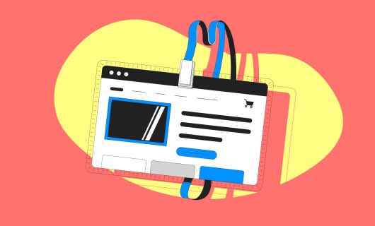
There’s a tendency to concentrate only on the content and the design of a website when you’re creating it, and we often forget there are other factors that have an impact on users’ experience. The aesthetics, fonts, colors, load speeds, and general coherence of the site are some of the essential elements for the usability of a website. In this article, we give you the means necessary to master your website’s ergonomics.
What is an erognomic website?
What defines ergonomics?
Ergonomics was defined by Alain Wisner, a progenitor of the field of ergonomics, as:
“The collection of all the scientific knowledge related to human beings and necessary to create tools, machines, and devices that can be used, in maximum comfort, security, and efficiency.”
Alain Wisner
Ergonomics and the web
Since the web began, ergonomics has been applied to this new channel. The ergonomics of a website includes all recommendations with the goal of optimizing the user’s experience on a website and improve their comfort navigating it. It aims to create a useful and useable website. In other words, it tries to understand user experience and puts practitioners in their shoes to make their experience as nice as possible.
The importance of an ergonomic website
A physical store that’s unorganized and cluttered will have a tendency to drive customers away. This also applies to websites. A website that’s complicated to understand, on which it’s difficult to find what you’re looking for, will frustrate users, and the same as with a messy store, a user will leave your website to go elsewhere.
Here are a few very unergonomic things that risk driving away users:
- A site that loads too slowly
- A site where the user doesn’t understand what’s being offered
- A poorly structured site where the user might get lost
- A disorganized site with too much information
- An unreadable site
Working on your website’s ergonomics is essential for attracting and keeping users on your site for the longest period possible, encouraging them to take certain actions (read content, make a purchase, or fill out a form on your website), and retain them.
Boost your SEO with an ergonomic website
Improving your website’s ergonomics contributes to boosting your search engine ranking. The goal of all search engines is to make searches easier for users by providing them the websites that seem the most relevant to their search. Improving your ranking in search engines requires fulfilling several criteria, and your website’s ergonomics is one of them. Working on your website’s ergonomics helps you:
- Improve your user experience
- Enhance your brand image
- Increase the traffic on your website and hence boost your reputation
- Promote your site’s conversion rate
- Retain your customers
Let’s take a look at some of the rules you’ll need to follow in order to make your website more ergonomic and make navigating it easier for users.
Our 9 tips for an ergonomic website
Summary:
- Don’t overload your homepage
- Structure your pages for readability
- Your website should have a coherent structure
- An intuitive menu makes for an ergonomic website
- Choose an ergonomic font
- Choose your colors well
- Optimize the load speed for your webpages
- Remember mobile and tablet browsing
- The 404 error page
1. Don’t overload your homepage
The homepage is the first thing users will see of your website, so it’s often the page that will see the highest traffic. The impression that this page will give, then, is crucial for making users want to stay on your site and browse to other pages. The aesthetic quality of your design is, of course, important, but the goal of this page is first and foremost to be clear and effective.
Putting yourself in the shoes of a user of your website, information should be understandable, precise, and concise. Don’t overload your homepage with information; an overcrowded page will lose users who won’t know where to look or click. Make your users’ lives easy—they should be able to quickly tell where to click to find the information they’re looking for, so prioritize simplicity and moderation.
Don’t be afraid to use blank space. We often feel like blank space is there to be filled, but that’s not necessarily the case. Blank spaces help a user’s eyes focus on the important information, and make content easy to read. Use blank spaces to limit distracting elements. Of course, you’ll need to make sure to have balance and don’t leave your page too blank, leaving your users in the void.
In the same way as too much text and images, also don’t overload your page with animations, a site that moves in every direction won’t give users the desire to stay. You should give preference to judiciously used animations that highlight your text or help a user along through your page. For example, you can use micro-interactions—animations on buttons when a user passes their mouse over them. You can animate buttons that lead to your products, your contact information, your social media, or any other page. These animations will make it possible for your to add life to your site while showing the user where to click or find what they’re looking for.
In summary:
- Don’t overload the page
- Prioritize important information
- Guide your user in their path towards other pages
- Use blank space wisely
- Emphasize the main elements of browsing and interaction
These homepage tips are also valid for any other pages on your website. Your pages should be clear, clean, and efficient! Keep this rule in mind: 1 page = 1 idea to get across. If there are multiple ideas, make multiple pages.
2. Structure your pages for greater readability
The hierarchy of elements on a page should be easy to understand at first glance. For that, be sure to make your content hierarchical. For example, for an article, use a clear hierarchy like this one:
- Main title – H1
- Title 2 – H2
- Title 3 – H3
- Paragraph – p
A hierarchy of sizes for these different elements makes it easier for your readers to understand your content. The same goes for all page types, product categories, product names, descriptions, etc. All these elements should be easily differentiated.
You can also add a summary at the beginning of the article so that the user only just has to click on the title of the section they want to read in order to access that content and scroll down the page to it. Again, the goal is to maximally facilitate browsing on the page.
3. Your website should have a coherent structure
The structure of your website is of the utmost importance. You should carefully consider the organization of pages and the architecture of information to make browsing easier for users. Think about laying out your site’s pages so that the information is easily accessible. Your site’s organization should be logical to the user—each page should have a specific purpose, and this should be easily identifiable.
Additionally, the structure of your site should be coherent throughout your website, the overall page design should maintain the same logic and the header should stay the same across all pages. Give your users consistent guides to lead them through browsing your website.
4. An intuitive menu for your ergonomic website
Your website’s menu is a key element for improving your users’ browsing. A clear and intuitive menu from first glance saves users time by directing them easily to what they’re looking for. The menu, as previously mentioned, should be available on all of your website’s pages so that your users can orient themselves at any time.
Your menu’s titles should be both clear and concise. Your users should be able to tell where they need to go to find what they search at just a glance.
Using breadcrumbs can add comfort to your website’s navigation. This assists your users with browsing and allows them to keep track of where they are on your website.

Using breadcrumbs is all the more important for large websites where it might be hard for users to follow the hierarchy of the website.
Also, you should consider adding a search bar in your menu. Whether you have a small or a large site, some users know exactly what they’re looking for. A search bar is an added benefit that will save these users precious time.
5. Choose an easy-to-read font
Reading text on a computer screen quickly tires the eyes. You should try to avoid large blocks of text and use fonts that are easy to read and not too exotic. Fonts like Lato, Roboto, or Raleway are very frequently used on websites for this.
You should also try not to use too many different fonts. Concentrate on 1 or 2 fonts so you don’t lose coherence. You can then play with light, normal, bold, and italic versions of fonts. For titles, you can be a little more creative, but be sure to emphasize readability.
Here are some tips to follow in terms of text:
- Only underline links
- Avoid font sizes that are too small
- Break your text into paragraphs and include key titles
6. Choose your color scheme wisely
Your website’s color scheme, first of all, fulfills a decorative role, which impacts the experience of the users. But that’s not the only reason why you shouldn’t take it lightly.
Your stylesheet should be consistent across your entire website, so consider using the same stylesheet on all your website’s pages so that your site maintains coherence throughout. You should also consider using colors that colorblind people can distinguish.
To maintain consistency, once you’ve chosen your colors, consider creating a large color palette with these. That way, you only need 2 or 3 colors, but with a large number of different shades, this allows you to stay consistent and not turn off your users with a bunch of colors that tire the eyes. Abrupt color changes should be avoided.
You can, however, use different color schemes in a specific context: CTA icons and buttons (the “call to action” that directs users to specific actions). For these elements, you can use brighter colors that attract the attention of the user.
You should also be sure to consider the level of color contrast. Remember: the main goal is that your text should be readable. Focus, then, on the contrast between background colors and font colors, to ensure the readability of your content. In particular, you should pick colors like dark grey for your text.
7. Optimize your pages’ load speeds
Who like waiting for a webpage to load? When a page takes too long to load, most internet users change websites. Today, we are used to websites that quickly load and we get quickly annoyed if that’s not the case. Consider optimizing the load speed of your pages to keep your users and potential customers from leaving, but also to keep Google bots and other web crawlers from downgrading your website’s search engine ranking. For that, we recommend in particular:
- Reduce the size of your pages (often this means comprising your images)
- Delete obsolete plugins
- Reduce the number of redirections
- Minimize CSS and Javascript files
- Activate browser caching
- Reduce server response times
8. Consider mobile and tablet browsing
Today, more than half of web searches take place on a mobile phone or tablet and 73% of internet connections take place on a smartphone*. Responsive design (website design that’s adapted for mobile and tablet browsing) is, then, essential to the ergonomics of your website. With responsive design, your website’s visuals will be automatically adapted to the devices used to browse your website.
“Being responsive means ensuring that your website offers an optimal user experience whether a user is browsing from a desktop, a mobile device, a phone, or a tablet, whether horizontal (landscape) or vertical (portrait).”
Thomas, UI Designer at Gandi
It’s important to consider the mobile aspect of your website, since your site can be perfectly optimized for a desktop computer, but not at all adapted for use on mobile. To adapt your website, you can, in particular:
- Try to use square photos, which are better for mobile
- Compress your images to accelerate your mobile load time
- Adapt your buttons and icons so that they aren’t too small on the mobile version
*(data from We are Social 2020 report)
9. 404 error page
You should avoid having pages that result in a 404 on your website. It’s frustrating for users to try to reach a page that doesn’t exist. However, by customizing the 404 page of your website, you can make this experience less annoying for users and you can help them find another page that might have what they’re looking for.
Conclusion: How to make an ergonomic website
The ergonomics of a website primarily rely on the clarity, hierarchy, simplicity, and coherence necessary to optimize user experience.
Follow these basics of ergonomics to help you get ranked higher in search engine results, but also to improve your users’ activity on your website so that they stay on your website and move to take action.
You now have everything you need to create a quality, intuitive website that will meet your users’ needs while facilitating navigation.
Build your website with WordPress, the most widely used CMS in the world. With WordPress, easily build an ergonomic website without having to have any particular technical or web development knowledge.
Get your domain name + WordPress hosting + 2 email accounts with 3 GB o storage and 1 free TLS/SSL certificate!
Tagged in SEOWordpress